New identity, strategy and product
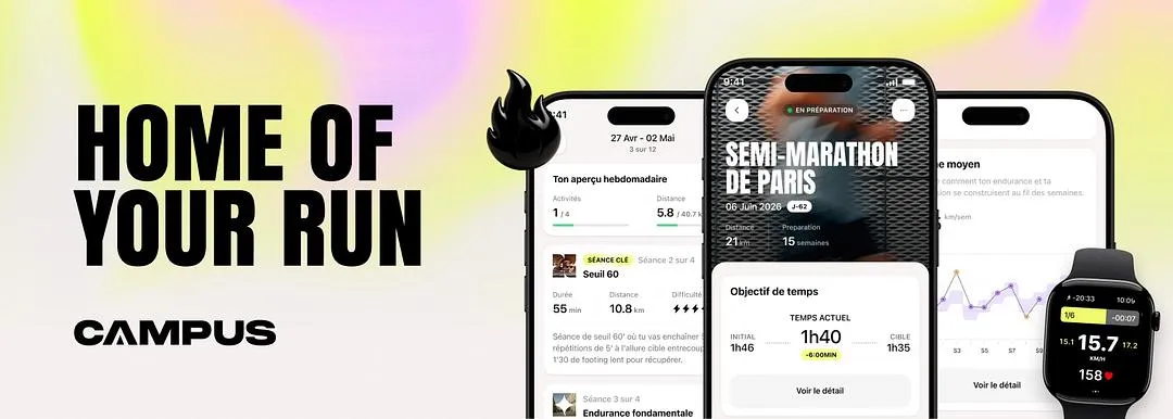
A running coach by subscription, built with real trainers.
- Role
- Lead Designer
- Timeline
- Nov 2024 → Nov 2025
- Team
- 4 designers, 1 PO, 4 engineers, 2 data, 1 head of training, 3 founders
- Problem
- A plan promised as adaptive, but computed once and for all, that only athletes could follow.
- Outcome
- The move from static plans to plans that move, the 4.8 rating held through the operation, and a research cycle still in place after my departure.
Nothing was blinking.
I arrive in November 2024. Subscriptions were climbing, the App Store rating would not move from 4.8, and the company had just gone from fifteen to thirty people in a few months, paid by its subscribers alone, without ever raising a euro. When a curve does that, nobody looks for what is wrong.
Nine paying subscribers out of ten had connected a sports watch.
A frame before the plan
Campus promised a training plan adapted to each runner, one that reduces injuries. Before getting one, you had to fit inside a frame.
You enter the date of your marathon. If it falls under twelve weeks away, the next button stops responding: that is not enough to prepare a marathon. The app is right, and it has just closed the door without learning anything about what you wanted. Two ways out, meet the conditions or give up. The third is lying about the date.
At the other end, the same lock. Plan finished, Campus does not remember that you just trained for twelve weeks: it looks at your level, and asks for twelve weeks again for the next goal. Yet someone coming out of a preparation is, on that day, the best-prepared person in the whole base.
The plan itself did adapt. Badly, but it adapted. The locks were at both ends. What is left is asking who a frame like that works for anyway: someone whose week is already organized around running, and who ticks the conditions without thinking about them. In other words, an athlete.
| What it promised | What it did |
|---|---|
| A plan adapted to each runner | A frame to fill in before earning one |
| To address every runner | 72% of respondents ran three times a week or more |
| To plug into each person’s daily life | Garmin, Coros and Suunto were integrated, the Apple Watch was not |
The product was built for athletes and sold to runners. Its indicators were accurate. They only measured the people it had already chosen.
And they did not measure much. In the subscriptions table, eight rows out of ten had no status. The company decided on intuition, and its intuition was good. It simply had no way of knowing when it would stop being good.
The app when I arrived
- The week
- The goal questionnaire
- Picking the race
- The statistics
- The profile
- The export to the watch
The plan did not bend
Nearly one user in two hit a doubt or a blocker shortly after signing up. We surveyed 135 of them, then called ten back.
| Share of the blocked | What they cite |
|---|---|
| 25.9% | “I cannot modify my program” |
| 18.5% | “I cannot change the plan’s duration” |
| 17.9% | “The app did not match what I expected” |
In interviews, the list of impossibilities was always the same: starting a plan less than twelve weeks before the race, following a trail race with a casual run, adding a second goal judged too close to the first, adapting a session to the heat or to a week of vacation.
Too rigid, I could not start my half after my trail race. It felt like a wall.
That one had just run a trail race. The product asked him to start from zero.
One of them was ready to pay. He got blocked while defining his goal, and he left to subscribe to a competitor.
This is not a list of grievances, it is a mechanism. The product imposes a frequency. The calendar blocks along the way. The person lies to keep going. The plan recomputes from a false statement. It proposes a load the body cannot absorb. It produces the injury it promised to prevent.
We also held a conviction I never saw verified: that forbidding a race would be enough to turn someone away from it. People who already have a bib go.
A survey run in parallel with 371 churned subscribers measured the same mechanism from the other end: the exit.
| Why they leave | |
|---|---|
| The reason does not depend on Campus | 29% |
| The app no longer answered my need | 23% |
| I chose another training method | 16% |
| The price is too high | 14% |
| The training no longer suited me | 9% |
Price comes fourth. More than half of the departures come down to the product experience, and the detailed motives repeat word for word what the interviews had surfaced. Among those whose app no longer answered the need, 63% wanted more personalization and 26% no longer had enough weeks left before their goal. Among those the training no longer satisfied, 24% wanted to choose their number of sessions per week.
And among those who declared leaving for a reason unrelated to Campus, 41% had gotten injured. The product promised to reduce injuries.
Asked what would have kept them, 31% answer features that solve their problem, against 22% a discount. The lever was not commercial.
The two surveys do not contradict each other, they split the subject. Among those who never started, price blocks: 28% found the subscription too expensive and half said a free trial would have helped them begin. Among those who paid then left, it is the product. Price keeps people from entering, rigidity makes them leave.
A third of the accounts had no goal
22% of respondents simply wanted to start or ease back in, 12% to get back in shape. None of them was preparing anything.
I wanted to get back to running to feel comfortable climbing, which is my main sport. Not a racing plan.
I just wanted a trail plan, no test and no time trial.
The product knew how to do one thing: prepare for a date. Without a date, it had no entry point to offer, and base training remained what you do between two real things. In the database, a third of the accounts had no registered goal.
The app was not short on features
It had too many. Each one served acquisition, and none touched the reason people left.
The brand and product teams had stopped talking to each other. Each produced on its own side, neither shipped with the other.
Drawing more was therefore not what was missing. What follows rests on three decisions.
Warn instead of block
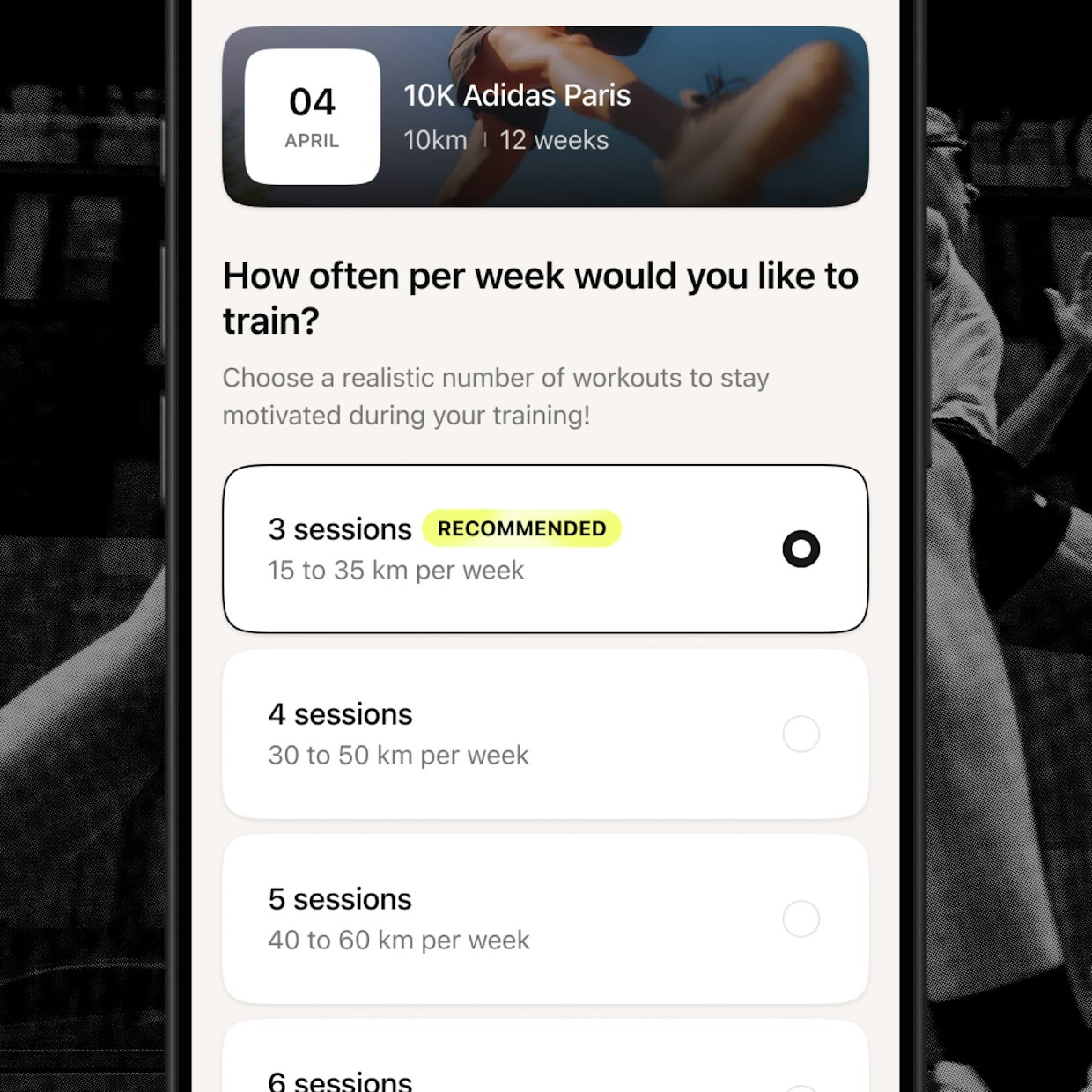
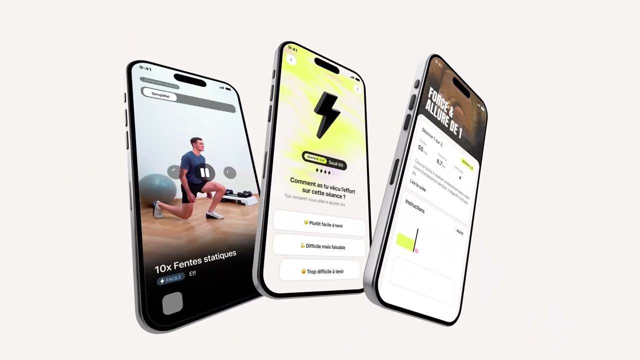
The first decision is a rule, and it fits in five words: the product warns, it no longer blocks. A duration too short or a volume too low no longer close the flow. They show what they cost, and the person decides.
| Setting | Before | After |
|---|---|---|
| Frequency | Imposed | Suggested, then chosen |
| Typical week | Single | Moderated |
Campus still proposes a number of sessions, computed from the goal, the volume and the current shape. It no longer imposes it. When the person picks less than the optimum, they are warned, and they go through.
The rule has its limit, and two goals close together give it: they do not hold together, and the product asks you to name one as primary, the other as secondary. The flow stays open, but the choice is put in front of you. Warning is not allowing everything: our job is to train the person, not to tell them yes.
The product gains what it used to lose: it finally knows what people actually want, since they no longer have a reason to lie to get through.
It is an uncomfortable decision for a team of trainers, because it accepts that the plan will be worse than the ideal plan. A plan held at four sessions beats a perfect plan at six, abandoned in week three.
It shipped to production in October 2025, in version 4.6.0, announced to the community in one sentence that sums up the rule: a personalized recommendation, and the freedom in the person’s hands. The calendar followed, with secondary goals that finally allow preparing a season rather than a single date.

The other end of the loop is after the race. The feedback was brought down to three answers, and above all it no longer stops there: depending on what is answered and how many times in a row, the plan recomputes. An isolated “that was rough” is a bad day. Repeated, it is a miscalibrated load, and the model hears it.
From the same decision came a flow for those who race against no one: an entry point without a race date, where base training becomes a program instead of being what is left when you do not have one.
Where the running happens
When I arrived, the desktop was still what got designed and what got shipped against. New features were born there, and mobile received them afterwards, as is. It was not a mobile app, it was the same app squeezed narrower, with the patterns of a desktop screen.
No competitor had a desktop app. For a simple reason: running happens outside, and the screen you carry is a phone.
But the hole was deeper than the platform. Campus did not measure the run. It produced a plan; the execution happened elsewhere. Either a watch picked up the session and sent back what had happened, or you re-entered it by hand when you got home.
Manual sync, too much of a constraint.
The real disappointment I had at the start is that you have no tracker.
This is not a comfort detail. A plan that adapts needs to know what happened; without measurement, there is nothing to adapt to.
We were integrated with Garmin, Coros and Suunto, the three brands trained runners wear. Not with the Apple Watch, which everyone wears.
No Apple Watch, I gave up.
And a Campus plan is not a distance to cover. It is a session: durations, paces and zones to hold in a precise order, with recoveries in between. That does not get memorized at the start line, and it does not get followed by pulling your phone out of your pocket every 400 meters. You need a device on the wrist that walks you through it.
In other words, only the wearers of a compatible watch could actually follow what they had bought. The others received a plan that was readable and unexecutable.
Nine paying subscribers out of ten had one. That number does not say the problem was small: it says the sorting had already happened. Those without a watch had left before anyone could count them.
That is where the mobile pivot stops being a platform question. The phone is not the fallback screen for those without a watch, it is the only device everyone already carries while running.
The answer shipped in two halves. An Apple Watch app for those who wear one, a phone-only tracking for everyone else: the session unfolds while you run, and the data arrives afterwards, with nothing to type. Campus finally measures the run.
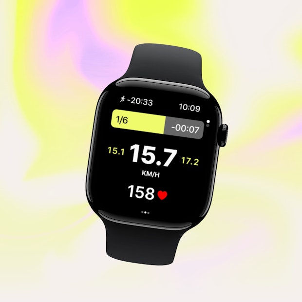
For those who wear a watch
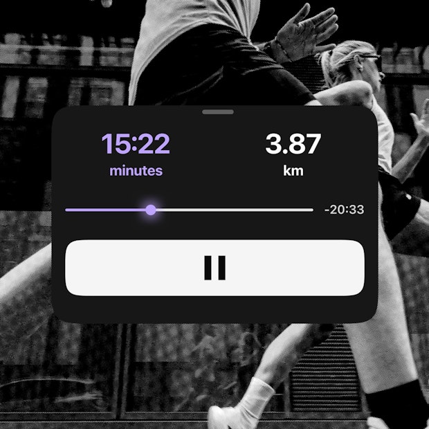
For everyone else

The carbon copy had a consequence I had not anticipated. Since nothing had ever been designed for mobile, there was no mobile interface pattern to draw from. The vocabulary had to be built before anything could be written with it.
The desktop stayed, and it was not a margin question: Campus sells its subscription on mobile like everywhere else. It was a dependency question. Keeping the desktop means keeping a place to sell and to serve subscribers the day Apple or Google closes the door. A company decision, not a product one, that I did not make and that held.
The numbers then showed usage split between the two platforms. Once mobile was favored, most of the usage moved there.
A brand drawn for the booths
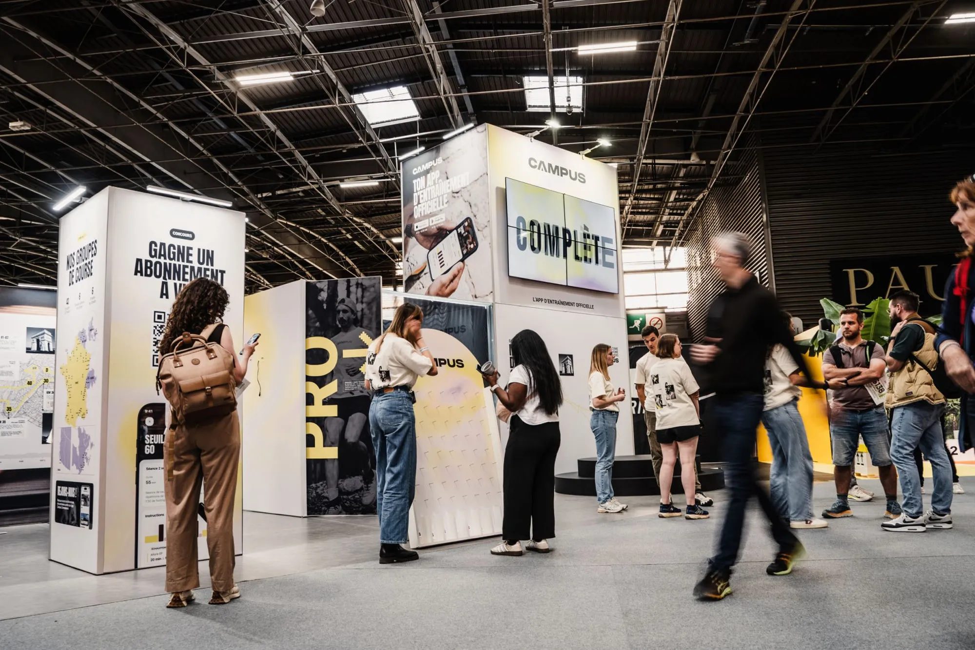
The brand team, at Campus, was called the studio. It had produced a v2 of the identity, designed for events: trade shows, booths, what you display to recruit runners.
The product never really followed it. When it tried, things broke: contrasts that did not hold on screen, components that did not exist in the states the app needed. So it drifted away, quietly, decision after decision. Nobody ever settled it; the two teams simply stopped agreeing.
Yet Campus does not sell events. It runs them to acquire, and of course the brand has to stand up on a booth. But what it sells is an app. Code.
The identity therefore had to start from the app and extend outward, not the other way around. A color that fails contrast on a phone held in full sunlight is not a brand color, however right it looks on a poster.
That reversal is what put the two teams back in the same room, and the identity ended up reaching every screen of the app, which none of its previous versions had managed to do.
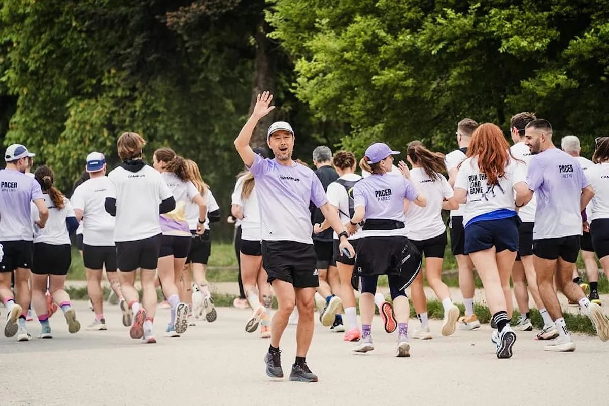
The pacers’ tee-shirts
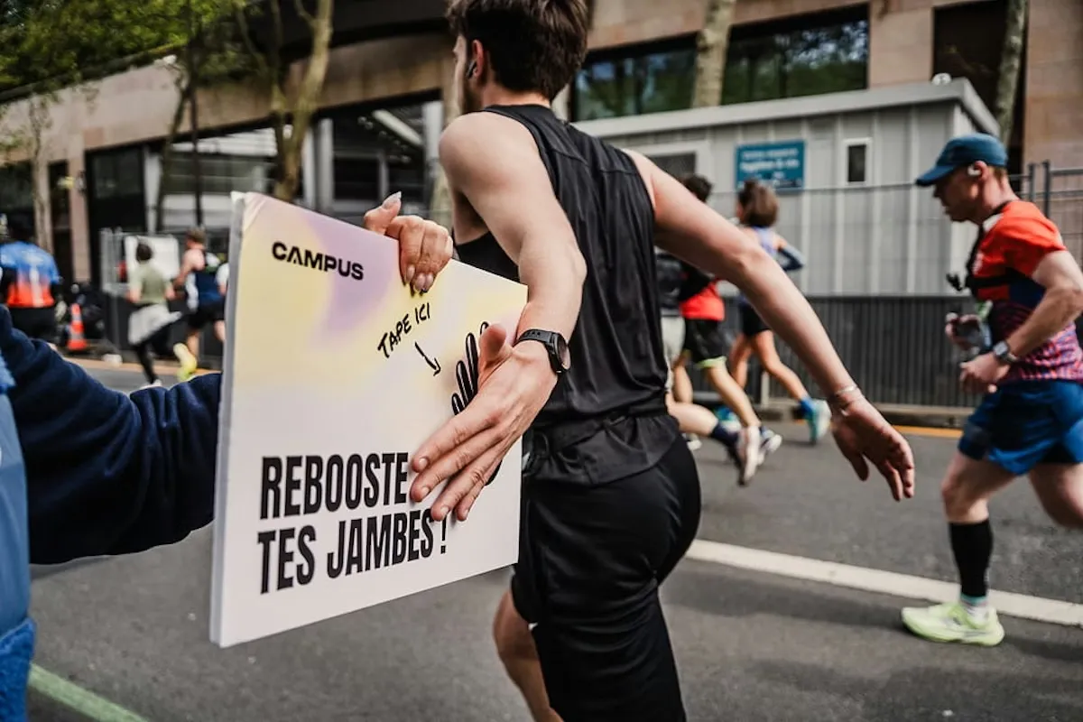
A sign along the course
The design system served as the common language. Before, one concept had three buttons, two cards and four ways of being selected. After, one pattern per concept, shared tokens, and a vocabulary the Flutter developers used too.
Once the direction was set, I brought in reinforcement. Finding the app’s interface, then holding it across the volume of screens to produce: both happened as a group. Directing that work was as much the job as drawing it.
Prove the model before repainting
Reopening the models produces nothing visible for months. To avoid disappearing while validating them with Max and Cyril, we kept shipping the roadmap in parallel.
The model was therefore proven on screens nobody had redesigned, before the new identity arrived. What worked owed nothing to the paint, and a redesign that ships as one block never says which of its two halves produced the effect.
From that work, the product kept a through line it did not have: the software proposes, the person decides.
What remains
We installed  Amplitude and laid a taxonomy over the critical
journeys.
We ran three studies during the mission, on inactive users, on those who had
churned, and on an international rollout. We defined the indicators design
follows, and they survived my departure.
Amplitude and laid a taxonomy over the critical
journeys.
We ran three studies during the mission, on inactive users, on those who had
churned, and on an international rollout. We defined the indicators design
follows, and they survived my departure.
The rating stayed at 4.8 through the entire redesign, which was the only result I truly cared about: remaking a product people love without breaking what they love.
The app redesign and the brand rollout shipped in spring 2026, after my departure. It is the only proof that matters that a cycle was installed: the work continued without me, and it shipped.
I did not remake the app. I installed a cycle that lets the team remake it knowing why.
Credits
With Max Roquigny, product designer, and Cyril Schmit, Head of Training Science, we built the training through line and ended up developing the models. Cyril handled the exchanges with Tristan Pawlak, co-founder and head of training, and with the ML team led by Emma Leiner, AI engineer.
Brand platform with Bureau Sonore, visual identity with The Design Crew, rolled out in April 2026. Reinforcement on screen production with Justin, sent by Julien Pelletier.
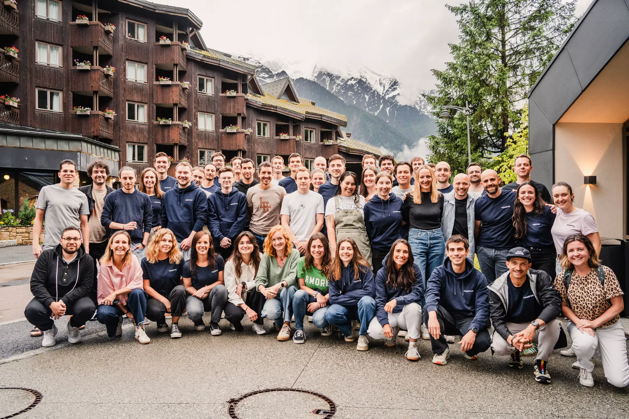
Thanks, finally, to the internal Campus teams, product, engineering and the trainers. I built strong ties there, and with some of them we keep in touch.
Nine releases shipped to production on this mission, each one announced by Campus. They are listed on the Work page.
Kudos
While designing a training experience, the team benefited from Jocelyn's technical and above all strategic qualities. In particular, I remain struck by his uncompromising insistence on placing the end user at the center of his thinking, and by his ability to shift his own point of view and that of others, always in service of the user.
Jocelyn is also a colleague particularly appreciated for managing to combine listening and high standards, which is why I naturally recommend him.
 Cyril SchmitAbout product, sport and human behaviors